Now for something entirely different. As regular readers know, I spend a lot of time thinking about music and all the things about listening to music historically has meant to mean. The entire experience if you will. For many years before iPods and streaming services, part of that overall experience was reading or looking at the liner notes when you first listened to an album (at the very least). With that in mind, I had the idea to explore the liner notes of albums I love in more depth.
So, without further ado, I’m going to do just that. This should be the first post in what will probably become a lengthy project—a project that will take a significantly longer time than the Lifetime in Songs project, and that took a couple of months to get through. I’ll start with a record that just turned 35 years old last week (July 28): Lifes Rich Pageant by R.E.M. This is a very important album for me, and probably my second favorite R.E.M release after Fables of the Reconstruction. Oddly enough, I see these two album as almost a pair or diptych (I’ll explain more below).
This was the first album I make a huge effort to get on the day it was released. I drove about 75 miles from my rural home to a record store in Roanoke, VA, to purchase it. The friend who drove with me purchased a cassette to listen to in the car on the way home, so while it was the usual experience, I did open the record up on the trip home and looked at the liner notes while listening.
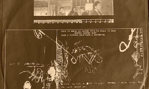
When I pulled out the sleeve, the image on the left (the front) was facing upward. I’m not sure if it was packed this way on purpose, but I’d like to think it was now, though I never really thought about it one way or another then, and I don’t recall such a first impression from many other albums.
The front is pretty standard branding fare, used to set the tone for the music on the record. There’s the obligatory picture of the band, which to my eye looks like it could be a screen still from the documentary Athens, GA Inside Out. It has that feel. The band is in a space that looks like it is still in progress of construction, which brings me to the diptych I referenced above. At the time, Michael Stipe said, “Lifes Rich Pageant was the reconstruction of the deconstruction that Fables became.” Whether on purpose or not, this picture sort of captures that spirit, and when paired with the liner notes with the previous album (future post alert), seems almost spare and considered.
Once that bit is past us, we moved to the figure and mix of typed and handwritten lyrics—all from “Cuyahoga,” which is on the album’s second side, serving as a preview of sorts I guess… an inducement to revisit the liner notes throughout the listening experience. The figure and line art also seem sort of like schematics, which gets back to the reconstruction idea mentioned above. As do the lyrics. They show the song as it is being build so to speak.
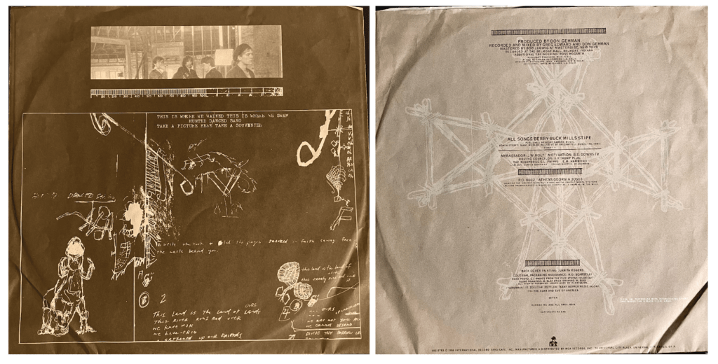
The rear of the liner notes are much more straightforward. No weirdness here. It’s mostly credits. Who, what, where, when, etc. All the legalities and such. But, at the same time it does show that the album is indeed constructed (yeah yeah, I’m pushing this, and I can’t promise a payoff, but it’s my damn blog so there). It does get a little interesting with the titles of some of the folks though. We have the “Ambassador: J.W. Holt,” the “Roving Councilor: G.P. Trump,” and “The Righteous S.L. Phipps” among others.
One of the two really interesting things (other than that titling) is the art, which actually has a credit: “FIG. OO1 POLYNESIAN BOYS INTERLOCKING STICKS THAT WAVES CAN A MASS I.E.G. LAND”. I note here, the schematic title (so maybe I’m not so far off, eh?) and how the figure calls back to the themes of the song featured on the front.
Finally, after all the nuts and bolts are set and complete, the experience of the liner notes closes like the album does, with “Swan, Swan H”.
SEVEN

HURRAH WE ARE ALL FREE NOW

CONTINENTS AS ONE
So the liner notes close as does the album with the statement of hope. A hope that seems more elusive than ever, when we can’t even put this corner of this continent in any kind of order, now even more than then.
P.S.: Then there’s the I.R.S. Guy. Back in the day, I pretty much know if it was an I.R.S. release, it was going to be pretty good. I had such a relationship with that label that I made my own t-shirt of the logo using a handmade stencil and black spray paint. Some of y’all may even remember it from college if you think hard enough.